Happy New Year friends! The start of 2014 brought more snow here in New England, covering the landscape in a fresh blanket of white. But with it came blustery winds and single digit temps. As I write this (Saturday afternoon) the sun is streaming through my window, and if I close my eyes, I can imagine I'm on a tropical beach basking in the sun (I wish!!) But with the temperature hovering in the low 20's, I'm going to be spending the day inside.
Currently I'm working on two client projects where we are deciding on wall paint colors in different shades of white. Let's take a look at how you can use "Winter Whites" in your decorating scheme, while keeping the winter chills out!
On her blog
Decorating files, designer Peggy Pardo gives her reasons why white is such a great color to work with:
- White is associated with purity and innocence, but it can also be dramatic and chic.
- White is fresh and airy. Using white on walls, furniture or floors brightens a room and creates the feeling of a larger space.
- White is the perfect backdrop for fabulous art, because it doesn’t compete but rather highlights everything around it.
- White is extremely versatile in that it works with any style, period or space.
- Bright whites are at home in modern spaces, while warm whites soften and convey a sense of comfort.
- White instantly transforms almost any piece of furniture. Painting a mixed jumble of different pieces of furniture in the same white color unifies them.

- via
White walls may make you think "pure and simple", but narrowing down the right white can be anything but! Ranging from bright and icy with hints of blue to warm whites with touches of yellow, the choices can seem overwhelming. But by following a few guidelines, you can find that "just right" white. Designer Thomas Peasant offers this advice-
1. Decide on the mood: Bright bold whites will stimulate and awaken you, while mellow, buttery whites will relax and calm you.
2. Determine your style: If you are wanting a bolder, modern feeling, always lean towards the brighter whites. These will create sharp contrasts when placed next to colorful, as well as neutral, fabrics. But if you’re going for a more mellow feeling, lean towards warmer whites. These warm tones can create an artificial ‘glow’ that warms up a space even on a rainy day.
3. Consider the room’s purpose: Always think about the purpose of a particular space before choosing a paint color. If it’s a room to relax, like a bedroom or sitting room, you’ll want to choose a more mellow white. But if you’re painting a stimulating space, like a kitchen, the color needs to feel warm without lulling you to sleep.
4. Test it out: It’s very important to test several shades at home, and in different areas of the room: the brightest spot, darkest corner, and ceiling. Look at the swatches at various times throughout the day to see how the color changes.
In this living area (featured in House Beautiful) the walls and ceiling are painted Benjamin Moore's Winter White. Wood floors, a mix of antiques, natural elements and a mix of metals warm the large space.
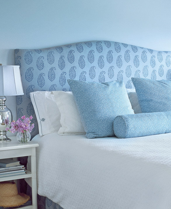
Shades of cream in this bedroom create a restful backdrop, and a striped red pillow and a pitcher of flowers add a pop of color.
In this family room, the built-ins are painted Benjamin Moore's White Dove, the same color I used for my
dining room hutch.
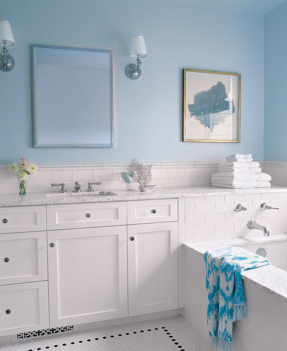
In this entry, the walls are painted China White by Benjamin Moore. The white sets off a Swedish demilune table and French pen-and-inks. Using variations of white adds textures and layers and gives the room an ethereal feeling.
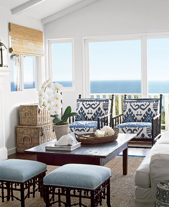
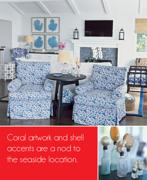
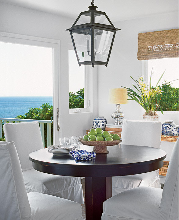
A few more white rooms to inspire you...
For a list of designer recommended whites, head on over to
Fieldstone Hill Design , where Darlene has rounded up the favorite whites from thirteen talented designers. And if you're still undecided on which white to choose, Kris at
Driven by Décor offers 8 Tried & True Paint Colors, many of which I've successfully used.
Stay warm!
As always, feel free to leave a comment or ask questions in the comments section below.
Need help creating a home you love?
Contact me about our design services.